In my time at Vegas.com I served both UI/UX design and graphic design functions. This is an overview of the heavier UX work I performed.
Role
Designer with Creative Director overseeing work performed
Deliverables
Mockups, prototypes, user testing
Objective
Being an online travel agency, experience improvements largely focused on conversion
I undertook three main feature updates in an effort to not just improve conversion, but also better guide users to make more informed decisions, thus lessening the likelihood of bad reviews.
Research
Continual competitive research and user research were key in understanding the market
User testing was vital in validating assumptions, performing lower level tests with prototypes before we had to go into expensive development, and discovering user behaviors and patterns. These tests helped drive the product, and conversion, forward in an ever changing landscape.
Learnings
As simple as it may seem, the KISS rule really played out before our eyes
As one may expect, with e-commerce simplicity really is the best policy. Reducing friction was a key theme throughout all of the projects I worked on.
Mobile Billing Path
Doubling conversion with simple tweaks
When this project got underway, the core goal was to modernize (at the time) the mobile billing path. I quickly moved into testing the existing one to begin understanding what we were currently doing, and comparing that against what other companies were doing. These included both online travel agencies and more traditional e-commerce brands. The reasoning for this was, we were unique in that we operated with a shopping cart. Most online travel agencies support a singular end to end product purchase.
What I discovered was, our current billing process involved upwards of 4 separate page loads, with numerous fields that weren’t necessary in completing the transaction.
The first thing I mentioned to product stakeholders was that mobile buyers are on mobile for a reason. The example I gave them was that of a customer who has arrived into Las Vegas, and decides spur of the moment to see a show. This was at a time where WiFi was also not nearly as prevalent as it is now, worsening the problem of asking for 4 separate page loads.
I asked for a list of the fields we didn’t need, in order to complete the transaction. Once I got the list, I began putting together wireframes that I discussed with stakeholders and that turned into mockups and prototypes to test with users in the field. The final experience ended up being a single page load, with 3 distinct areas, only collecting what was necessary to complete the transaction.
Upon shipping this update, conversion doubled overnight.
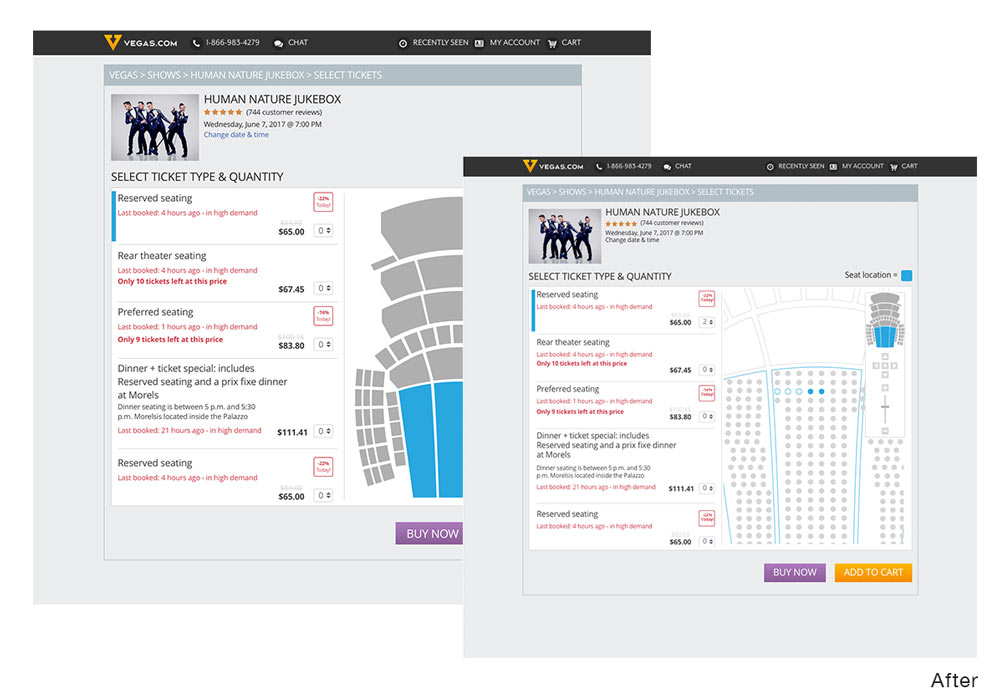
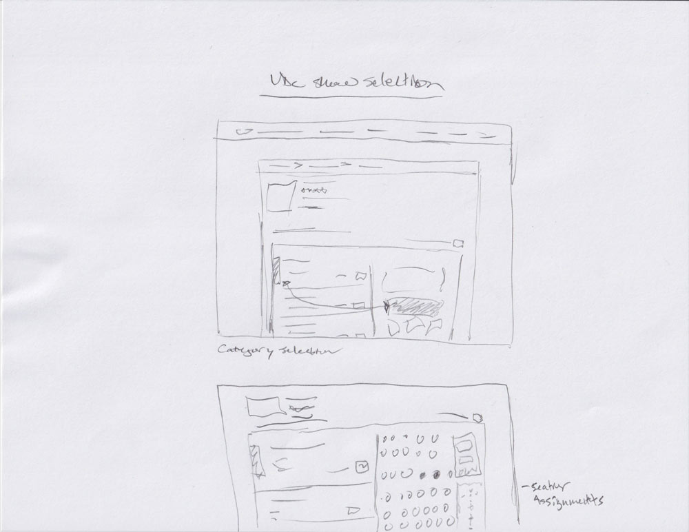
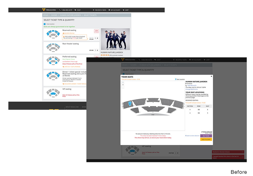
Show Ticket Booking Path
Dynamic seating blocks demand dynamic experiences
The way ticketing worked for shows, with there often being multiple vendors selling tickets to a show, was for the show to dole out blocks of tickets and sections, based, in part, on how much volume each vendor sold.
With users becoming more and more conditioned to more dynamic experiences as seen on other ticketing systems, I knew we needed to adapt.
I spoke with one of our lead frontend engineers about the possibility of using SVG theater maps and how those could be dynamically colored via css.
We crafted a process in which by naming each seat in the map (with PNG as a fallback) appropriately, our existing system could map seats to the corresponding dots, and make seats appear available, selected, or unavailable to the user.
This allowed for a much more interactive show booking process. I designed a flow that included section shading as the user hovered over what pricing section they were interested in, and then once that was selected, individual seats would be auto selected, with the ability to select others if desired.
This resulted in a 150% increase in conversion for shows.
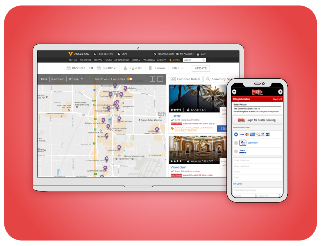
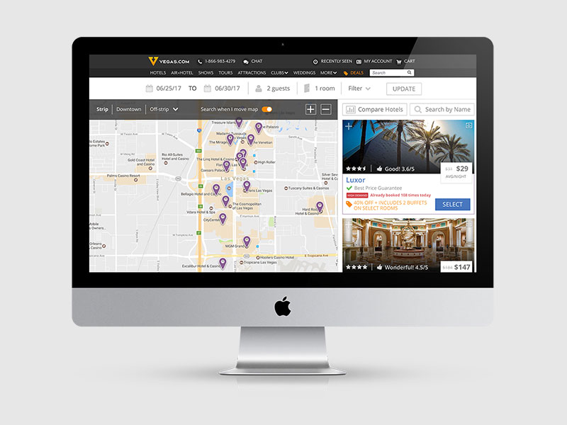
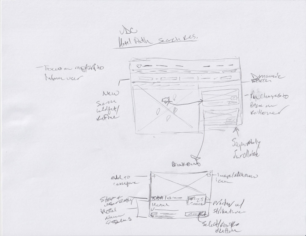
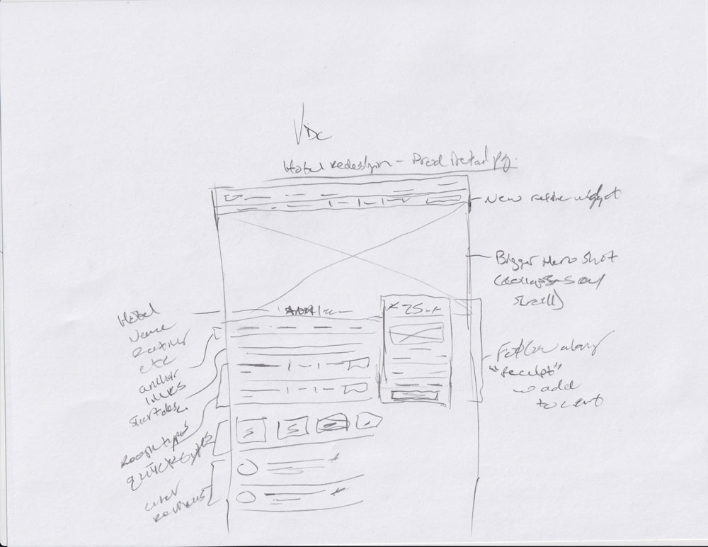
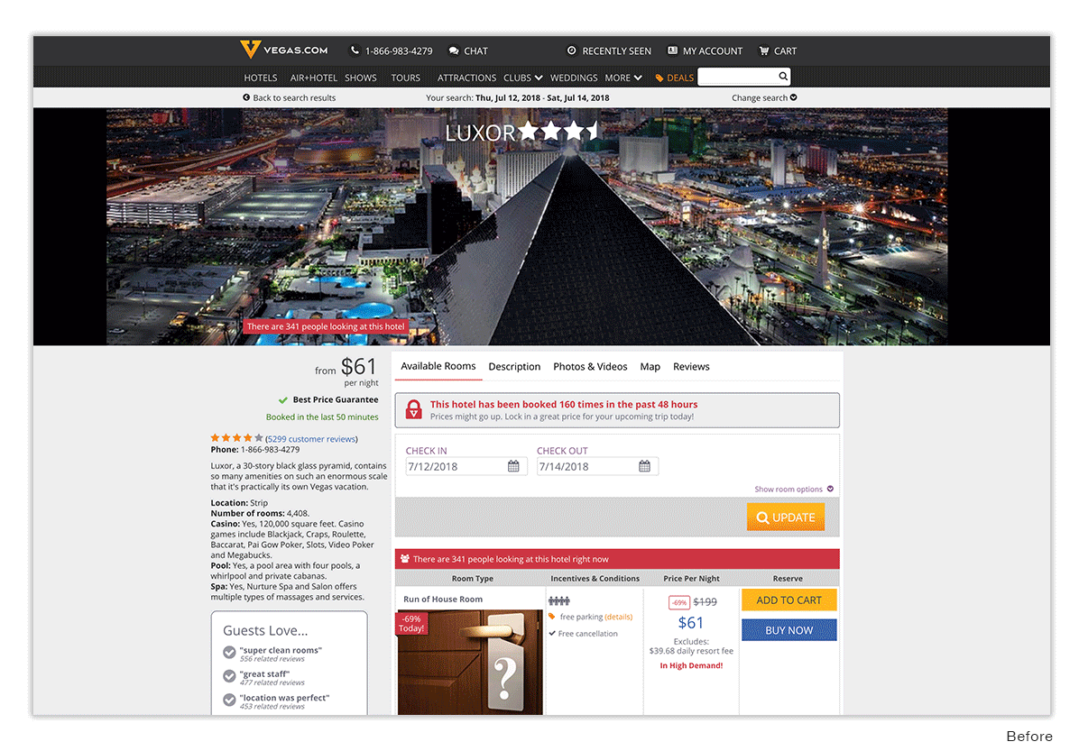
Hotel Search Path & Product Page
Educating users quietly
In doing some internal research, I saw one point being brought up in reviews time and time again: distance.
Customer after customer mentioned how far walking the strip was, often mentioning the hotel they stayed at vs where they spent their time. When you add in the typical Las Vegas heat, this can become even more frustrating.
I took this as an opportunity to drive change in how we thought of hotel search and how it affects the user’s decision making.
After much research and wire framing, I developed a default search that centered on a map view, to help visually inform users of the distance The Strip covers.
I paired this with a much more visual landing page for each hotel, and when the user had performed a search, we would show their trip total as a receipt that scrolled alongside them, with a buy button always present.